
The Psychology and Performance Behind the Rise of Dark Mode Design
Dark mode has taken over the web — from operating systems to social media and now websites. But its rise isn’t just an aesthetic trend; it’s rooted in user experience, visual comfort, and evolving design psychology. Let’s explore why dark interfaces have become the preferred choice for modern users and brands alike.
“Design must reflect the practical and aesthetic in business — but above all, good design must primarily serve people.” — Thomas J. Watson
1. Reduced Eye Strain and Visual Fatigue
One of the strongest reasons behind dark mode’s popularity is comfort. Darker backgrounds emit less light, making screens easier on the eyes, especially in low-light environments.
- Helps reduce glare and brightness contrast.
- Enhances focus for night-time users or developers.
- Feels softer during extended browsing or reading sessions.
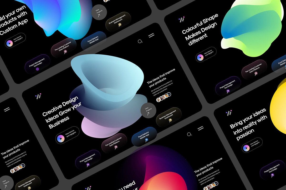
2. Enhanced Aesthetic Appeal
Dark mode naturally looks modern, sleek, and premium. It gives websites a cinematic and tech-forward feel, often associated with luxury and innovation.
- Emphasizes minimalism and visual depth.
- Makes colors and imagery pop more dramatically.
- Creates strong contrast for accent highlights like gold or neon hues.
3. Improved Battery Efficiency
On OLED and AMOLED screens, dark pixels consume significantly less power. Many users consciously prefer dark themes to extend battery life, especially on mobile devices.
- Dark interfaces save up to 30-40% battery on OLED displays.
- Eco-friendly design choices align with sustainable UX principles.
4. Focused Content Consumption
Dark mode eliminates visual noise by muting unnecessary background brightness. The result? Users pay more attention to your core content — text, visuals, or calls-to-action.
- Improves focus in text-heavy layouts like blogs and documentation.
- Boosts perceived readability in contrast-optimized typography.
- Encourages deeper engagement by reducing distractions.
5. Emotional and Psychological Impact
Dark colors convey mystery, authority, and sophistication. Psychologically, they evoke confidence and modernism — perfect for tech, creative, and luxury brands.
- Creates an immersive digital environment.
- Feels calming yet powerful, balancing emotion and logic.
- Aligns with the current cultural trend toward minimalism.
“Black is not sad. Bright colors are what depress me. They’re so... empty. Black is poetic.” — Ann Demeulemeester
6. Accessibility and User Control
Today’s users expect personalization. Allowing a dark mode toggle empowers users to choose how they interact with your website — enhancing accessibility and comfort.
- Improves usability for people with light sensitivity.
- Reduces cognitive load in low-contrast environments.
- Enhances inclusivity by respecting visual diversity.
7. Branding and Differentiation
In a sea of bright websites, a dark theme helps your brand stand out. When executed correctly, it can signal innovation, boldness, and forward thinking.
- Dark themes pair beautifully with accent tones like gold or teal.
- Gives creative industries and tech firms an identity edge.
- Supports storytelling through mood and tone.
8. When Dark Mode Doesn’t Work
Despite its appeal, dark mode isn’t for every brand or purpose. Text-heavy or academic sites sometimes perform better in light mode for readability reasons.
- Avoid pure white text on pitch-black backgrounds — it strains the eyes.
- Ensure proper contrast ratios for accessibility compliance.
- Test both themes across devices before full implementation.
Conclusion
Dark mode isn’t just a trend — it’s a design evolution born from user needs. It balances visual comfort, modern aesthetics, and performance efficiency. Whether you adopt it fully or as an optional toggle, dark mode can elevate your brand’s experience while keeping users engaged longer.